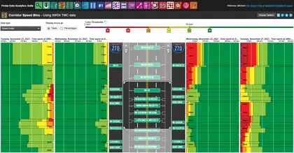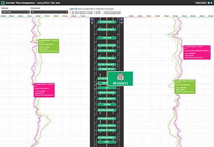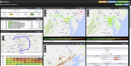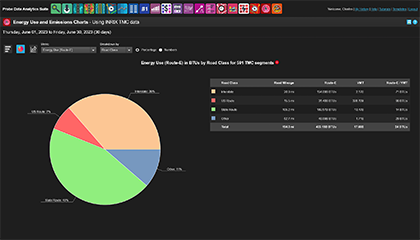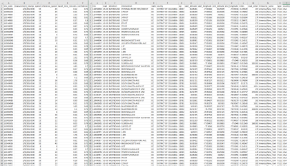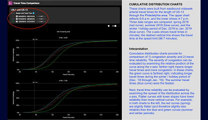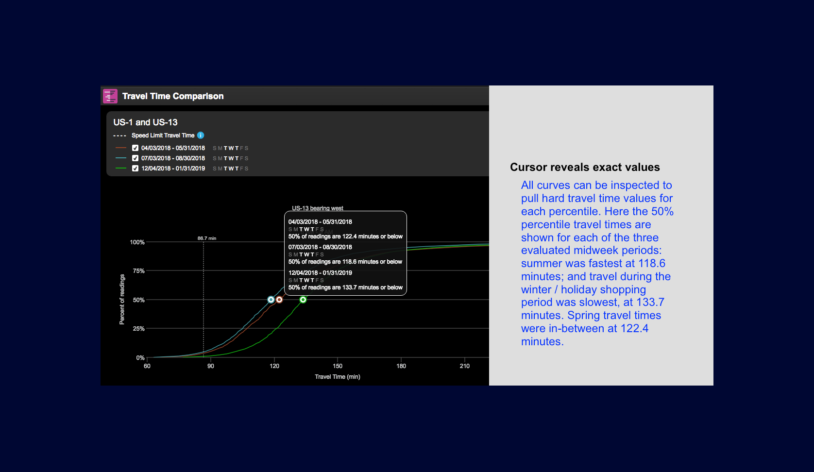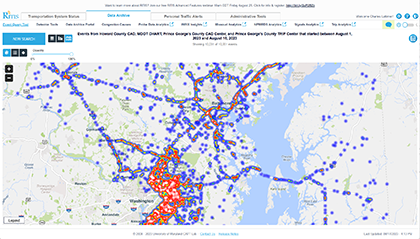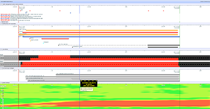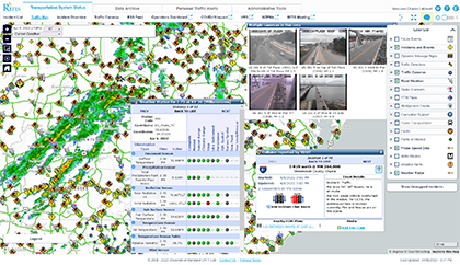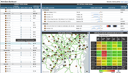


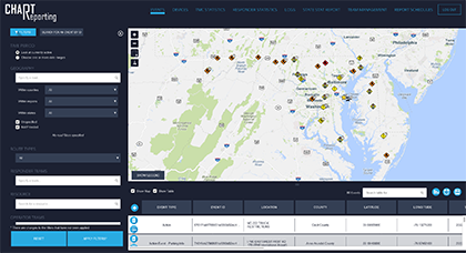
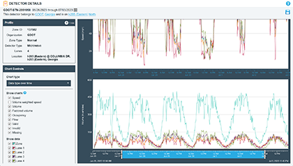
CHART Reporting
CHART Reporting is a custom analytics package built on top of data collected from the Maryland CHART System’s ATMS software, which includes data about traffic events, DMS, CCTV and other devices, and operator logs. CHART Reporting provides information useful for real-time operations and for analysis of performance over long time periods. Reports can be scheduled within CHART Reporting, which allows for automatic emailing of key performance metrics to interested parties on regular intervals. CHART has found this particularly useful during severe weather events, when keeping the public and key decision makers up to date is vital, and automating this task allows the CHART operators to focus their attention on addressing the problems at hand instead of compiling and mailing out reports.
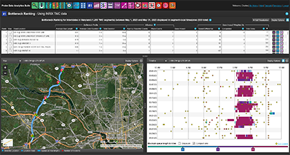
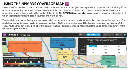
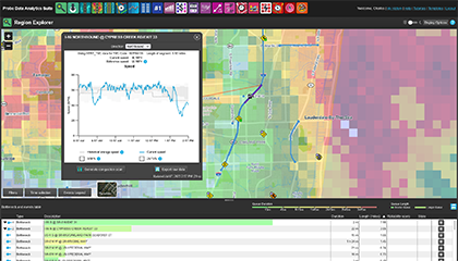
 Bottleneck Ranking tutorial
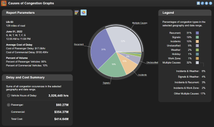
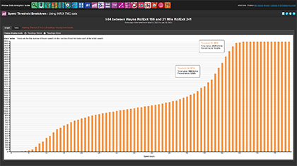
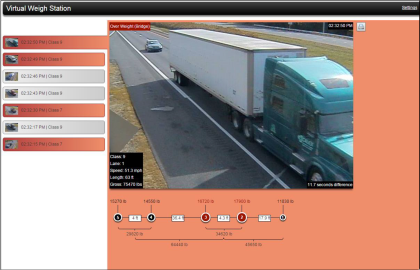
 Conduct an After-Action Review: I-70 Fatality Incident
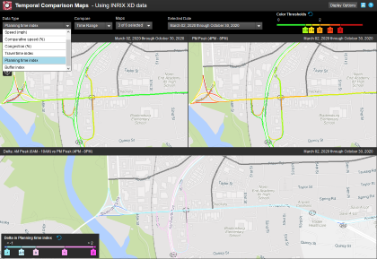
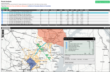
 Write a Project Assessment Summary Report: Project Assessment Summary
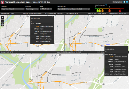
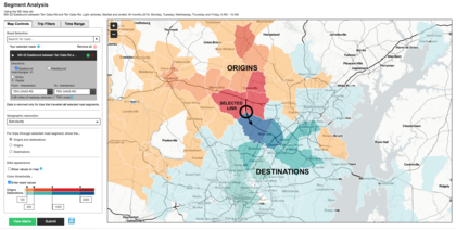
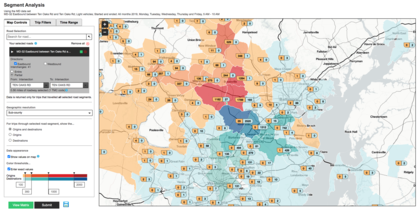
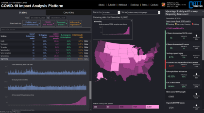
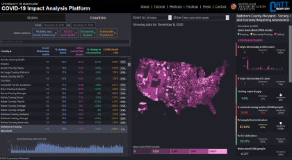
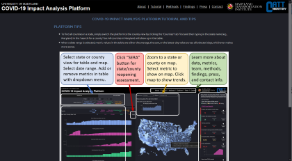
 Predict Holiday Travel Patterns: Labor Day Weekend Travel Advisory