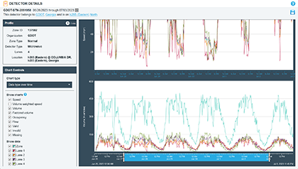
The Detector Profile displays readings and health data for a single detector for up to a three-month period. Using the time slider, you can zoom out to view data from the full time period you selected or zoom in to examine specific hours in particular, allowing you to identify patterns and anomalies in speed and volume data.
The Detector Profile works with both single- and multi-lane detectors.
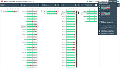
Detector Tools - Health Summary
Traffic detectors, being physical devices, are subject to damage, network outages, and miscalibration. The Detector Tools Health Summary displays the current and historic health of the entire detector system and allows you to drill into each region, road, and even the individual detector level to help you focus our maintenance efforts on the areas that need the most attention.
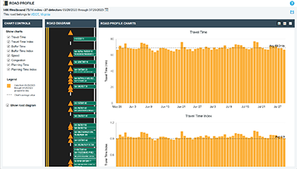
Detector Tools - Road Profile
The Detector Tools Road Profile allows you to analyze congestion metrics from detectors installed along a specific corridor, including travel time, travel time index, and buffer time index. This can help you understand the reliability of the performance of the roads on which detectors are installed.
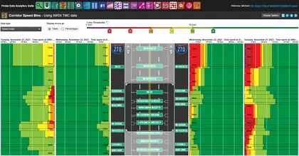
PDA - Corridor Speed Bins
Corridor Speed Bins allows you to visualize the number of probe readings recorded for speed (and various other congestion measures) for a stretch of road over a particular period of time. This is useful for quantifying just how good or bad performance was during time periods of interest or identifying areas where congestion occurs with high frequency. You can select up to seven unique time periods to compare, and you can filter those down to a specific time of day.
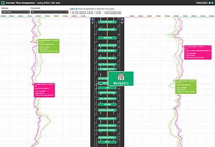
Corridor Time Comparison gives you the ability to visualize the variations in key performance measures along a roadway corridor.
Corridor Time Comparison displays bi-directional line charts associated with roadway segments along a corridor. You can select up to two separate date ranges and up to seven different time ranges within the date ranges selected. There is also a choice of five different metrics that can be displayed, giving you great flexibility and depth in your corridor analyses.
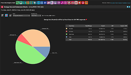
Energy Use and Emissions Charts allows you to create charts that break down energy use and emissions by road class and engine type. Within the resulting visualizations, you can switch between energy use from two models, as well as CO2, NOX, PM2.5, PM2.5NOX precursor, and VOC emissions that can be broken down by road class, hour of day, day of week, and month. You can also toggle between bar and pie chart displays. The scatterplot option allows you to analyze the relationships between any of the energy and emissions metrics as well as VMT. Each chart is supplemented by a table that provides a summary of the VMT normalized results. This tool is recommended for analysts interested in understanding the relationship between sustainability metrics and evaluating the portion of the targeted sustainability metric generated within a specific hour of day, day of week, month, or engine class.
PDA - Energy Use and Emissions Matrix
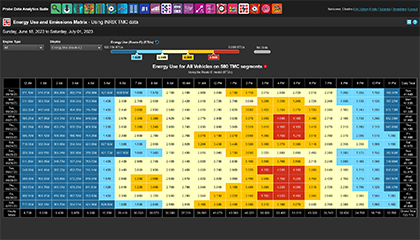
The Energy Use and Emissions Matrix creates a color-coded matrix of aggregated energy use and emissions estimates for all roads for each hour within a customized analysis period. In the resulting matrix, you can switch between energy use from two models as well as CO2, NOX, PM2.5, PM2.5NOX precursor, and VOC emissions. Totals across the hour, day, and each date within the query range are provided as well as the overall total. This tool is recommended for analysts interested in estimating aggregate hourly sustainability metrics to discover patterns or abnormalities.
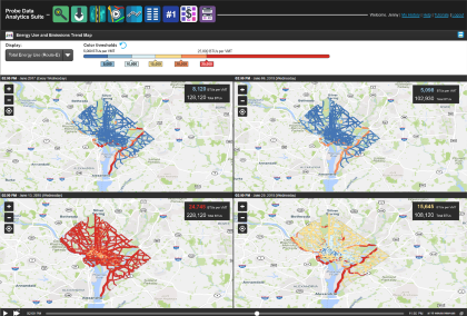
PDA - Energy Use and Emissions Trend Map
The Energy Use and Emissions Trend Map creates hourly animations of energy use and emissions on selected roads and date ranges. The output map provides estimates of energy use and emissions for each selected segment as well as the aggregate. Results are normalized by VMT to assist in identifying segments with abnormal sustainability performance. Similar to the original Trend Map, you can select up to seven time ranges to create synchronized map animations to discover differences in sustainability metrics from the driving mode. As with the other energy use and emissions tools, you can switch between energy use from two models, as well as CO2, NOX, PM2.5, PM2.5NOX precursor, and VOC emissions. This tool is recommended for analysts seeking to evaluate segment-level and aggregate hourly sustainability metrics on a time-stepped map-based visualization.
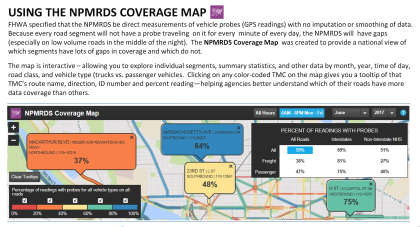
PDA - NPMRDS Coverage Map
The NPMRDS is a probe data set commissioned by FHWA and produced by the CATT Lab for use for free by DOTs and MPOs for use in their MAP-21 performance reports. The NPMRDS is powered strictly by probe readings, so if no vehicles are on a segment during a particular 5-minute reporting period, the NPMRDS has an empty record for that period. The NPMRDS Coverage Map lets you explore the prevalence of these empty readings with filters for time of day and type of vehicle.
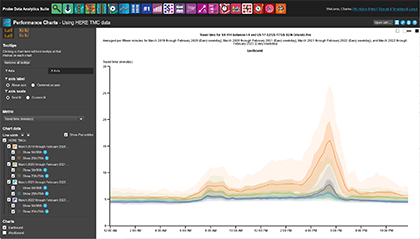
Use Performance Charts to prepare reports using a variety of visualization techniques – bar, line, scatterplot and candlestick – representing aggregate conditions across a road for key performance metrics. 5th/95th and 25th/75th percentiles ranges help underscore the significance of deviations from the norm.
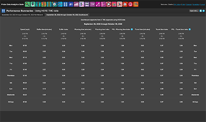
With Performance Summaries, you can produce reports on key performance measures over arbitrary geospatial and temporal parameters and see results by each day of the week.
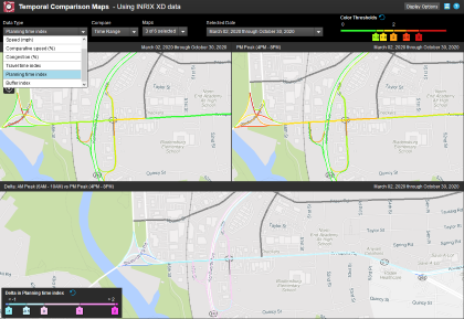
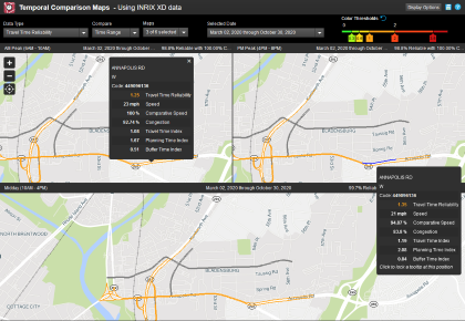
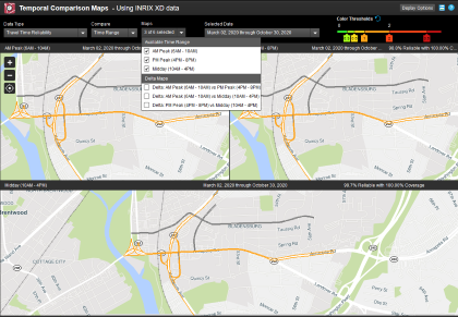
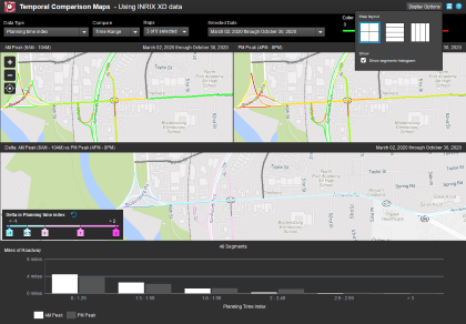
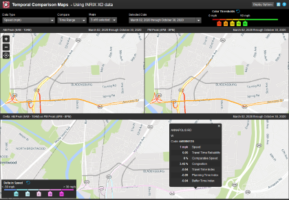
Temporal Comparison Maps gives users a unique set of functions to visualize and analyze geo-temporal data, in the form of maps, which render key performance indicators along a roadway corridor of interest. While PDA's Trend Map gives users the functional capability to visualize geo-temporal variations in your performance indicators, this powerful tool will also calculate the change, or delta, of your performance indicators across a customizable set of dates and time ranges. Temporal Comparison Maps gives operators and planners data-driven insights to better understand the impacts of specific improvements to the network or to observe trends over time that work zones or other natural events may have on a region.
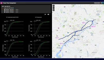
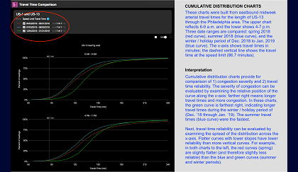
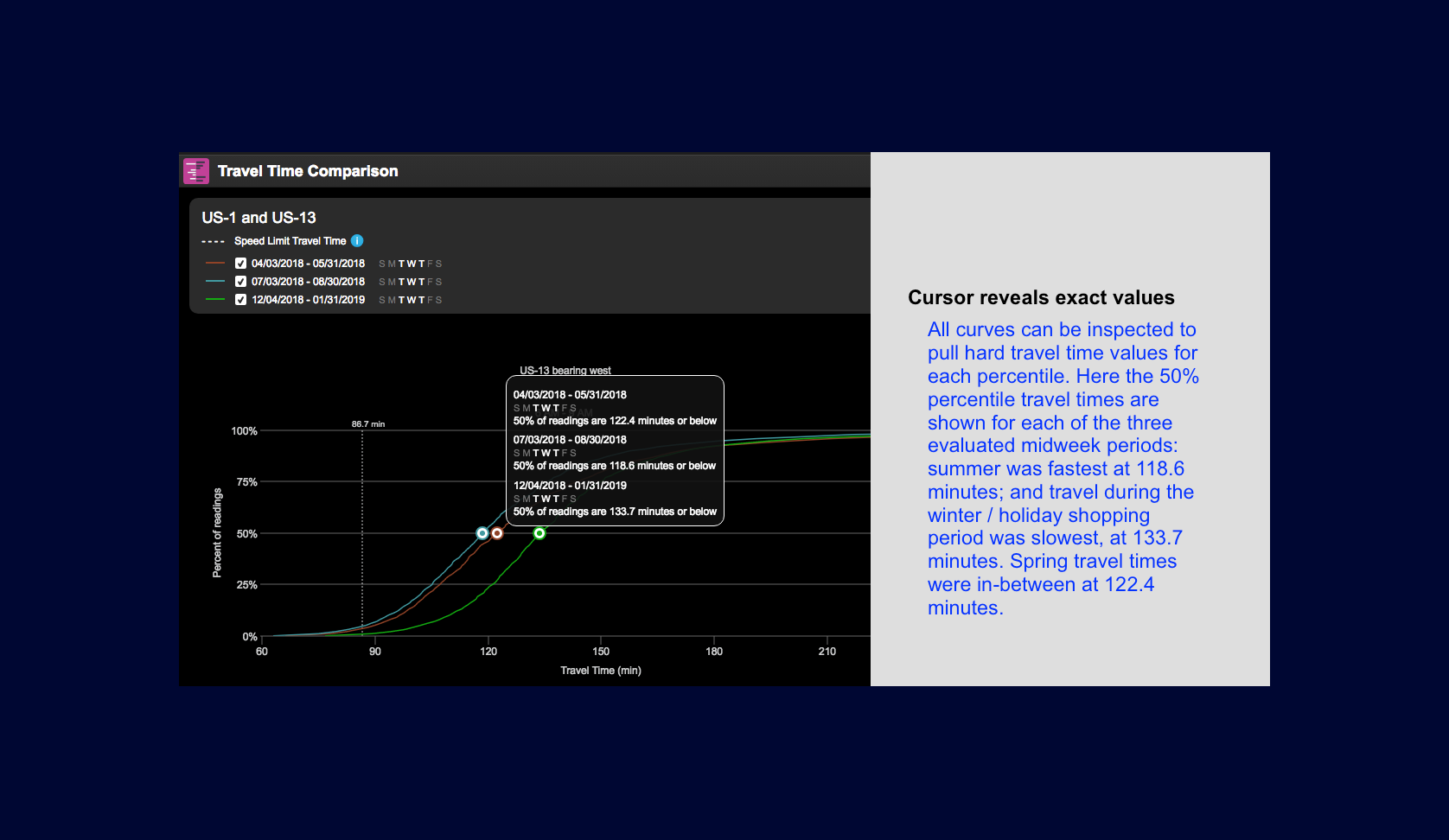
PDA - Travel Time Comparison
PennDOT commissioned the Purdue University Joint Transportation Research Program (JTRP) to design advanced performance metrics for signalized arterial highways that exploit next-gen probe vehicle travel time data (these datasets are produced at higher levels of spatial granularity). To deploy the research findings statewide, PennDOT then commissioned the work to add these metrics to the RITIS platform.
This tool allows users to perform a comparison of travel times on a selected corridor for specified “before” and “after” date ranges that can be filtered by day of week and time of day. The tool produces cumulative frequency diagrams (CFDs) of the travel times that illustrate the difference between the before and after conditions. This tool is useful for assessing the effects of maintenance, operational changes, capital programs and adaptive deployments.
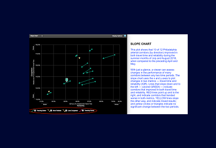
PDA - Travel Time Delta Ranking
PennDOT commissioned the Purdue University Joint Transportation Research Program (JTRP) to design advanced performance metrics for signalized arterial highways that exploit next-gen probe vehicle travel time data (these datasets are produced at higher levels of spatial granularity). To deploy the research findings statewide, PennDOT then commissioned the work to add these metrics to the RITIS platform.
This tool enables the user to view performance of multiple corridors for a specified date range, and to rank the corridors according to their travel time characteristics, including both the median travel time (which measures the severity of delays) and the interquartile range (IQR) (which measures the travel time reliability). The tool produces sorted bar charts based on either performance measure, or it produces a scatterplot to show the relationship between the two metrics.
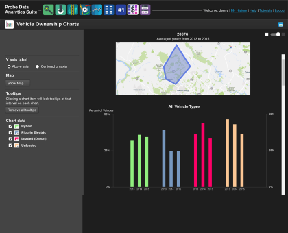
PDA - Vehicle Ownership Charts
Vehicle Ownership Charts supports annual trend analysis of vehicle ownership by inferred engine type (gas, diesel, hybrid, and plug-in electric) in regions of interest. Due to the format of the raw data, vehicle ownership is aggregated at the zip code level. Results are presented as multi-series bar charts. This tool is recommended for analysts interested in discovering the annual trends in vehicle ownership by estimated engine type.
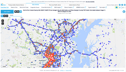
RITIS - Event Query Tool
All traffic event data collected by RITIS is archived indefinitely, and the Event Query Tool allows you to search that archive. In addition to allowing you to find individual events that match your search criteria, the Event Query Tool also provides charts displaying trends and maps displaying high-frequency event locations.
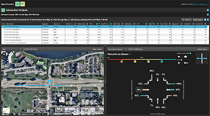
Intersection Analysis uses high-resolution probe vehicle-based trip data to assist you in analyzing the performance of one or more intersections. This tool allows you to analyze key signal performance metrics such as travel times, approach speeds, control delay, and percent arrival on green without deploying roadside equipment at an intersection.
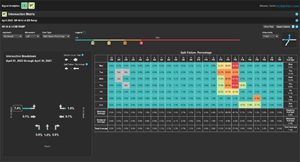
Signal Analytics - Intersection Matrix
Intersection Matrix uses high-resolution probe vehicle-based trips data to assist you in performing a detailed analysis of individual signalized intersections in your region, letting you see how performance changes according to time of the day and day of the week. This tool allows you to analyze key signal performance metrics such as travel times, approach speeds, control delay, and percent arrival on green without deploying roadside equipment at an intersection.
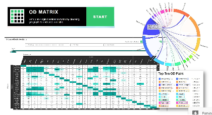
Trip Analytics - OD Matrix
Tools in Trip Analytics extract the origin-destination and routing patterns contained within very large sets of time-stamped "bread-crumb trails" generated by vehicles within the traffic stream.
OD Matrix generates zone-to-zone trip tables based on trip start and endpoints. Zones can be county, sub-county, or TAZ. Users can filter by date range, time-of-day, day-of-week, and by vehicle class — i.e., light-weight vehicles such as passenger cars, vans, and pick-up trucks; medium vehicles such as traditional single-unit trucks; or heavy vehicles such as tractor trailers. Within the tool, users can create traditional, symmetric OD tables (where the origins and destinations are identical) or custom OD matrices (where the origins and destinations can be different). These outputs are suitable for calibration of macro-level travel demand models (typically for a metro-area-wide region), as well as for many meso- and micro-simulation modeling applications.
Tools in Trip Analytics extract the origin-destination and routing patterns contained within very large sets of time-stamped “bread-crumb trails” generated by vehicles within the traffic stream.
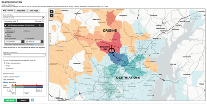
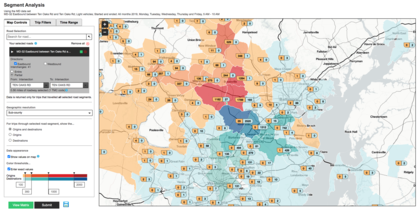
Segment Analysis maps origins and destinations for a selected road segment. You can filter for vehicle classes and time ranges. The resulting map will show the geographic distribution of vehicles that traveled the selected road segment. You can view trip totals for counties, sub-counties, or TAZs. For further analysis, this tool links to the OD Matrix so you can view the data in a tabular format.
Tools in Trip Analytics extract the origin-destination and routing patterns contained within very large sets of time-stamped “bread-crumb trails” generated by vehicles within the traffic stream.
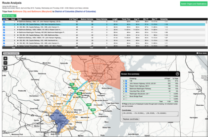
Route Analysis examines travel patterns between zones of Origin and Destination by compiling database trips that satisfy the user’s filters. The Route Table lists how many trips followed each unique route, and calculates travel time and reliability metrics. The Route Map displays segment-by-segment pathways; the user can draw screen lines or cordon lines perpendicular to traffic flows to produce sample counts and split percentages for each crossing.


 Corridor Speed Bins tutorial